Problems to solve
|
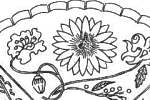
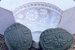
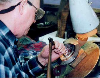
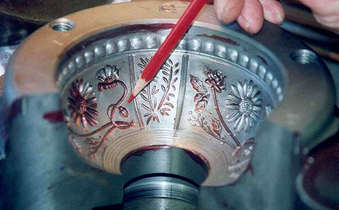
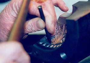
Here, Alan Van Dyke continues turn to work on the fine detail of the design. He painstakingly chips and files the design around the top of the pattern. It took him three days to round and smooth the three sections' top designs! Below, on the left, is a close up showing two sections of the mould. Although the picture gives the optical illusions that the mould is convex, remember that the design is cut into and does not stand out from the mould's surface. We had decided to have two different kinds of stippling on the "Flowers of the World" - one in the three larger panels and the other in the three smaller panels where the rosemary sprig was. Well, it turned out that Alan had a stipple punch for the smaller patterned area (you can see it in use, below right), but he did not have a punch to get the right kind of stippling on the larger panels. So naturally, he made a new punch, specifically for this job! |
|
|
|
So the stippling issue was resolved, but there was another problem!
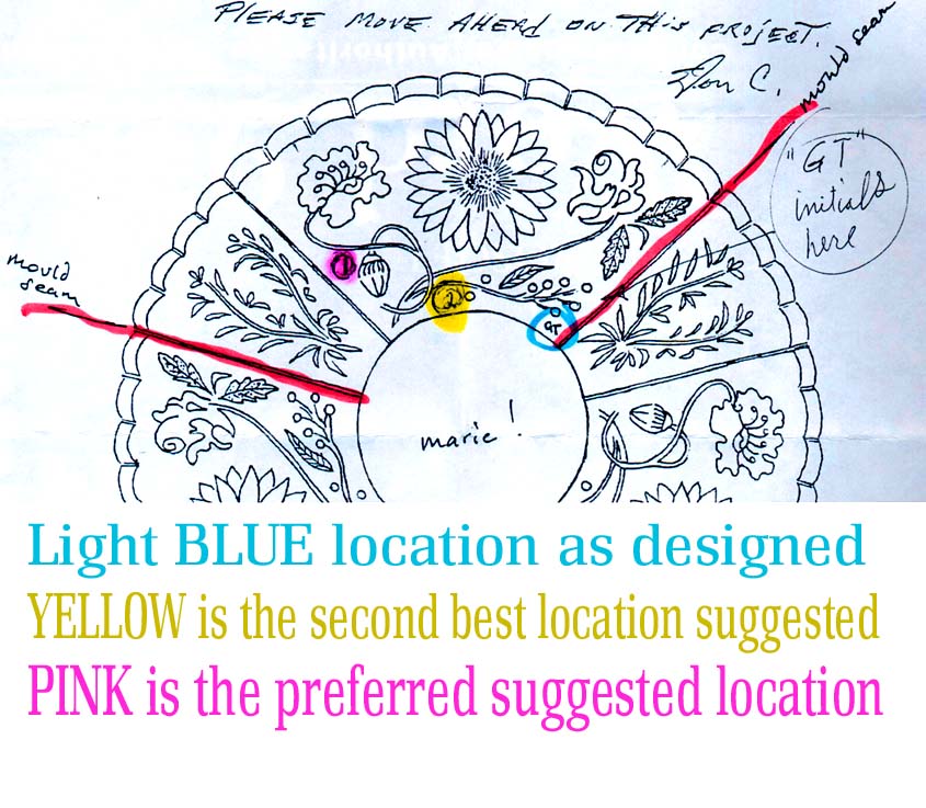
On January 29th 2000, Howard Seufer passed on a query from Fenton's mould shop regarding the placement of my initials (GT) on the design - and he sent the drawing on the right. Howard wrote: "This is a question from the mould shop bench. Alan Van Dyke said that the location adjacent to the mould joint limits the depth and detail possible on the initials due to the need to swing the pattern easily out of the mould. Further from the joint is preferred for better detail. Alan suggests the location shown in pink on the enclosed diagram (shown right), or possibly even a little lower than I've indicated. His second best suggestion is the yellow-indicated location. Both of these are more central between the swinging motion of the joints and so more true and definitive carving can be achieved. Please let me know whether you want to use the present location, or to choose an alternative? He will be getting to this detail in the coming week." And here is my reply: "Well, my real wish would be position #2 (yellow), at the bottom of the design. I really like the section of the design where the poppy stem curls around....and I think if the initials went there it would spoil that space. So, I'm opting for the second choice, if I may. Also, it doesn't matter if my initials are a little hard to read ..... actually, you could leave them off if the mould maker prefers, I don't mind. I just thought it added a little personal touch, and I know that at some time in the future, someone will pick up the bowl and say "Gee, doesn't that funny squiggle look like someone's initials? I wonder what it could mean?" |
|
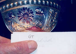
So, where did the "GT" go?
Alan drew my "GT" initials on paper, and copied them in reverse (to be backwards on the mould).
|
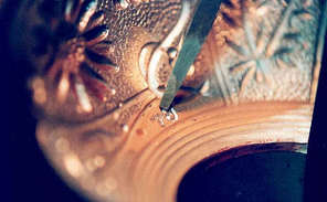
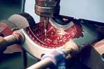
Then they were roughly carved into the iron.
|
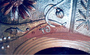
The finished initials (in reverse). As Howard wrote to me ....... "HOORAY! We're getting there.
|
Continue the journey - Almost there!