The Design: "Flowers of the World"
The exterior design, which I called "Flowers of the World," is full of symbolism, using the language of flowers to tell its own story and representing what the wwwcga club stood for (more about this later).
Creating the design may not have been easy, but figuring out how it had to be interpreted and adapted so as to be correct for use on the exterior of the piece was another matter altogether! The first version of the design I sent to Fenton proved to be too detailed and intricate. Howard Seufer had discussed it with Frank Fenton, Bob Hill, Woody Patterson and Norm Montgomery; the suggestions that came from these experienced people were that various changes should be made so that the design would be able to be cut into the mould better and thus the pattern on the finished glass would be bold and show good details.
They advised me to alter ("beef up") my design to increase the thickness of the leaves, stems, buds and seeds, as well as the flower petals. They also advised that I reduced the number of leaves and added stippling in the main panel as well, to enhance the final iridescent effect. Howard explained that an exterior design needed to be bold and sturdy as it would have to withstand extra heat; moreover, the pattern would be smoothed out somewhat by the finisher's paddle and it was important to take account of that in the design.
It was all great advice, and I created a bolder, simpler and clearer looking pattern (based on the same concept). The drawings below show you my first "final" drawing on the left and on the right is the one that actually went forward to be made. I changed the position of the poppy (and added a bud) and made the whole design stronger and less intricate and detailed. The stippling isn't shown (so as not to confuse the design) but we agreed that a different stipple would be put in the background on both the main panels and the smaller panels.
I haven't "cleaned up" these drawings for reproduction on this page. They were originally drawn in pencil and then ink - and the pencil was erased. You can still see the pencil markings and some of the smudginess from the lead.
Both are "one third" sections as the pattern was to be repeated three times.
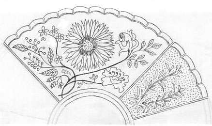
The first "final" design sent to Fenton
|
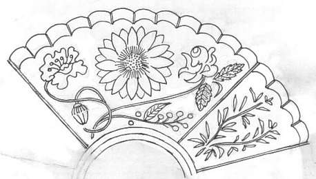
The design that would be made
|
|
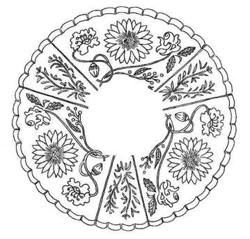
And so, on the right is the final, full design for the "Flowers of the World" that Fenton then began to work on. The symbolism of the design motifs The large central sunflower represents Kansas - for Topeka, Kansas - where the club's co-founders, resided. Kansas is also, of course, the heart of the USA. To the right of the sunflower is the rose, possibly the most popular floral motif of all - the symbol of beauty, the queen of flowers. The rose also represents England (the home to me, the designer, Glen). It is also the emblem of many US states and a favourite flower the world over. To the left of the sunflower is the poppy complete with bud - symbolizing peace, renewal and growth. A sprig of wattle blossom completes the panel to represent Australia. The smaller panels in the design depict rosemary, a symbol of remembrance for absent friends, those departed, those we loved and those who will be lost in the future. The next step in the journey is making the plaster mock-up. |
Continue the journey - the plaster mock-up