Carnival Glass Colours explained
Intentional or Accidental?
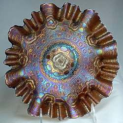
Of course, many of the Carnival colours that we identify today were almost certainly not intentional. The lack of quality control in the glass works meant that batch colours were not precisely standardised as they have been in more recent times. Also, there was a fair bit of experimentation going on. The Carnival Glass makers were doing “cutting edge” stuff and they were right at the front of the market. Red, in particular, was very much a new colour and getting it just right was not easy. Consequently, although the collector market may recognise subtle differences between shades (for example ice blue opal and powder blue opal) it’s most unlikely that the makers ever intended to create them as stand alone colours.
If you glance at Butler Brothers’ catalogues from the early 1900s you will see that the colours mentioned in the ads were mainly gold, royal, violet and green. Then, in the early days of Carnival Glass collecting, it was marigold, blue, green, purple and pastels ……. and red. That was it. Australian collectors made it even easier as they originally had just two options for Australian Carnival: marigold and dark! But in the last 20 or so years, collectors have made it all the more complicated, and now we can identify over 60 different colours.
Digital Images
Beware of image manipulation! All too often we see examples of Carnival Glass which are "hyped-up", enhanced or saturated beyond belief, so that the end result is entirely unreal .... and a huge disappointment if you bought it!
Why this complexity?
Identification and Classification: research and a desire to identify colours correctly and to add more information and insights.
Value: unusual colours often bring higher prices. Of course this will sometimes bring into play “wishful attribution” where someone believes their piece to be a more unusual colour than it actually is.
Communication between collectors, researchers and dealers: so that we can have a common understanding of the piece under consideration.
What exactly is colour - some of the technical stuff
Contrary to popular belief, "colour" is not really an intrinsic property of the things we see around us. Rather, it is the sensation resulting from a given spectral distribution of light, detected by the colour-sensors in the eye and interpreted by the brain.
When white light hits an object, it selectively blocks some colours and reflects others; only the reflected colours contribute to the viewer's perception of colour. The reflected wavelengths are what we perceive as the object's colour. So what we see as colour is the result of white light hitting an object – some of the light gets absorbed while some of it gets reflected. Our eyes detect this and our brain interprets it. We see colour with the sensors in the retina of the eye called rods and cones. The rods are sensitive to low light and the cones, which require a greater intensity of light, are sensitive to colour. The message is passed to the brain via the optic nerve. A small number of people may experience some level of difficulty in distinguishing between certain colours. Colour Vision Deficiency (colour blindness) occurs in about 0.5% of females but in around 10% to as many as 20% of males.
Now if the entire subject of colour started and finished right there we’d be OK, but the problem for us Carnival collectors is that we may perceive or interpret colours differently.
Perception
People observe or interpret colours differently – our perception differs and our use of language defines what we observe. An example will help to explain. Some years ago, when our children were young, we used to visit a big antique fair at Goodwood racecourse. Our journey home took us past a pretty church that had a copper roof – and it was always the cause of a good natured argument. Glen insisted the roof was turquoise bluey-green, while the children and Steve insisted it was green and they couldn’t see any blue shade at all. We were all correct, of course – we described what we saw.
|
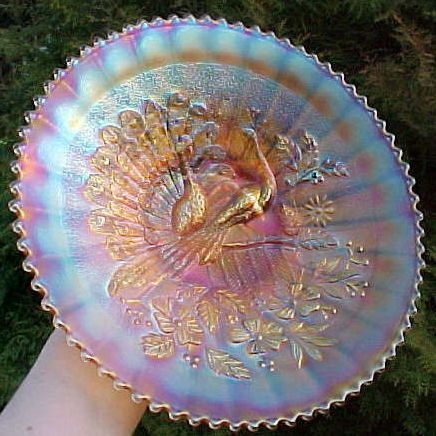
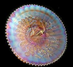
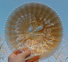
Our perception was different. Various things can affect our colour perception, for example the colours surrounding it. It is actually possible to perceive two identical colours as being very different if they are placed on different backgrounds. We experience this when we arrange our glass displays. You know how amazing pastel marigold looks against a dark or black background whereas it almost vanishes if you put it against a light background - see the photos on the right of a Northwood Peacocks plate in pastel marigold. |
|
|
Perception is also affected by the kind of light it’s seen in. Incandescent light, sunlight, fluorescent light – they can all alter the appearance of the glass colour. Daylight or white light is the best way to view glass. Twilight can have a strange effect on vaseline glass. We have a bay window in which we display a range of non-iridised, coloured pressed glass. In the summer twilight the vaseline takes on an ethereal, semi-glowing effect.
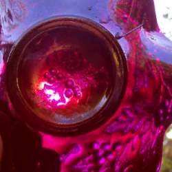
An example of the strange effects light can have on glass was explained to us some years ago when we were at the Fenton factory. We heard about someone who had purchased their Dusty Rose glass in the belief that it was a pale pinkish-purple. But when the glass was viewed in their home they thought they had a different glass entirely as it was blue. It turned out that the glass in question was neodymium, a dichroic glass that appears pink-lavender in natural or incandescent light but changes to become blue when seen under fluorescent light.
Different people use different words to describe colours, and we invent words to assist our understanding, often using “ish” to suggest a shade or a subtle nuance. When actual perception is tricky (the blue-green area is especially challenging!) it can be hard to pinpoint colours with words. If one thing is certain and sure, it is that the study of colour, in a Carnival context, is not an exact science. Perception, vocabulary, lighting, desirability and so on, all combine to give rise to debate and healthy disagreement. The desirability of a piece and its value, are markedly affected by colour.
There is also the problem of modern technology. Digital cameras, computer monitors, smart phones .... the colour variations they produce are immense. I know what I am seeing on my computer screen, but I have no way of knowing if your screen "sees" it differently. And then there is image manipulation! All too often we see examples which are "hyped-up" or saturated beyond belief, so that the end result is entirely unreal .... and a huge disappointment if you bought it!
And of course, colour can sometimes change depending on whether you are buying or selling a piece! "Wishful Attribution" can miraculously change a regular blue into a scarce blue, in the blink of an eye.
Finally, a reminder of how we classify Carnival Colours?
Click on any of the images below to see detailed explanations of each colour.