Carnival Glass Colours - Controversies!
There are a number of colours where either the perception or the categorisation of a colour is open to dispute. One particular section of colours – the blue-green shades – is fraught with differences of opinion. For example, it is difficult to come to consensus agreements on what is powder blue, or emerald green. Different people have different views and very possibly different perceptions and who’s to say which viewpoint is correct? Some years ago we asked three very experienced and knowledgeable people for their opinions on the colour of a specific Hearts & Flowers comport. One of them said it was ice blue opal, one said it was aqua opal, and the other said it was powder blue opal.
Throw away the rule book now. Ultimately colour it is in the eyes of the beholder. For some Carnival colours there are different opinions and no commonly accepted consensus. On this final page in the Carnival Colours feature we discuss some of the main areas of controversy.
Hell and Fiery Amethyst – Red or Purple
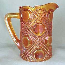
To be true red Carnival, it must have no purple tones. Northwood and Dugan did not make red Carnival. The bulk of red Carnival was made by Fenton with a small amount from Imperial.
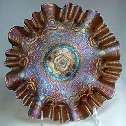
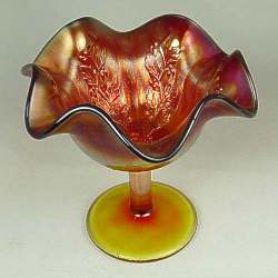
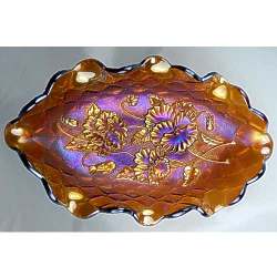
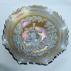
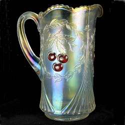
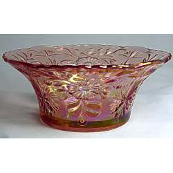
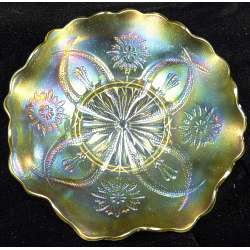
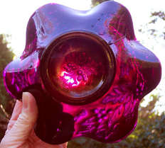
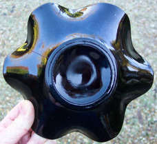
The main difficulty here comes when a (usually new) collector thinks they have found a Northwood or Dugan red piece. It is almost certainly a ruby purple colour - fiery amethyst! The pictures below show how the misunderstanding arises. On the left, this Dugan Holly and Berry bowl looks "red" when viewed against a very bright light, but it is in fact Dugan's fiery amethyst. The centre and right pictures show the reverse and the front in a normal light, when they look to be a dark purple colour.
Throw away the rule book now. Ultimately colour it is in the eyes of the beholder. For some Carnival colours there are different opinions and no commonly accepted consensus. On this final page in the Carnival Colours feature we discuss some of the main areas of controversy.
Hell and Fiery Amethyst – Red or Purple
To be true red Carnival, it must have no purple tones. Northwood and Dugan did not make red Carnival. The bulk of red Carnival was made by Fenton with a small amount from Imperial.
The main difficulty here comes when a (usually new) collector thinks they have found a Northwood or Dugan red piece. It is almost certainly a ruby purple colour - fiery amethyst! The pictures below show how the misunderstanding arises. On the left, this Dugan Holly and Berry bowl looks "red" when viewed against a very bright light, but it is in fact Dugan's fiery amethyst. The centre and right pictures show the reverse and the front in a normal light, when they look to be a dark purple colour.
|
|
|
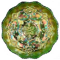
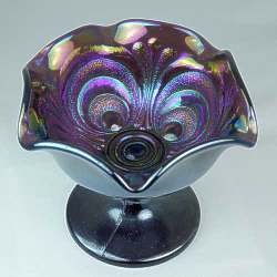
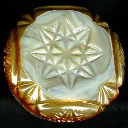
There is also the problem of recognition for black amethyst. Some people call it black amethyst when it is most likely a deep, dark purple. To be true black amethyst you should only be able to see a hint of purple when you hold the glass to a very intense white light. Debate centres around where fiery amethyst overlaps into oxblood and then on into black amethyst!
A Touch of Frost – Pastel / Ice colours
The main controversy surrounding the ice colours is must they be frosty or not? White, ice blue and ice green are the three main “ice” or pastel colours. The main difference of opinion and debate centres on the type of iridescence. Some say that it must be acid treated (frosty) while others say it need not be frosty, just pastel.
We feel there must be some frostiness (even if it is only very slight) otherwise why call it ice blue or ice green? It is surely just pastel blue or pastel green and not ice blue or ice green? And white without frosting is undoubtedly clear!
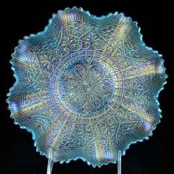
All at Sea – the Blue Green Dilemma
This is the area of greatest confusion, debate and disagreement. It is a complex area where peoples’ perception differs. One person’s aqua is undoubtedly another’s teal or even powder blue! The differences are in the eyes of each beholder.
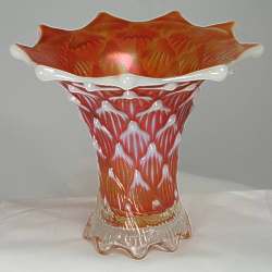
Powder blue is a delicate pale blue base colour, but some say it must have a pastel iridescence, while others say it can have a bronze or marigold iridescence. It’s debatable; there is no universally acceptable definition. Sapphire blue is another colour where debate focuses on the iridescence. There is debate and disagreement over whether it can have a marigold or a bronzy/amethyst iridescence or both, or indeed neither. Some say sapphire blue should only have a pastel iridescence, while some say it can have any type of iridescence.
Celeste blue is yet another colour that has a certain amount of debate around it. It is a light sky blue base glass, but some say it can have a marigold iridescence. We disagree totally with that view. For us celeste blue must have a pastel iridescence and should also have a stretchy/ onion skin effect.
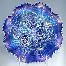
Emerald Green is the focus of a lot of controversy over whether the colour name refers to the base colour, the iridescence or a combination of both. Some say it is all in the iridescence and that it has to be a vivid blue-green effect in order to be emerald green. But there is no final consensus.
We’ve only just touched on the controversies here. Perception differs as do opinions, and maybe also whether you are a buyer or a seller!
Click any image to look at more colours