Collectors Facts - Quill, made by Dugan
|
|
|
Shapes:
Pitcher and tumbler only
|
Colours:
Marigold, purple
|
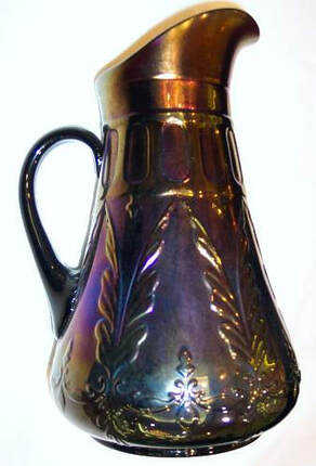
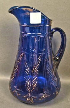
The pitcher is blow-moulded bulbous / tankard style with an applied, non-iridised handle.
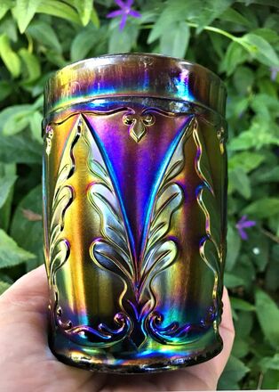
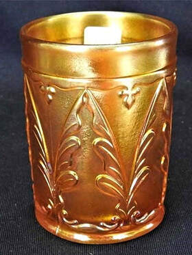
The Quill pattern was produced by Dugan in marigold and purple Carnival in the form of water pitchers and tumblers only, and is considered to be a scarce and hard-to-find pattern. The design was originally introduced by Dugan in 1907 as part of what they called their "Filigree Line" - a range of items in ivory, blue, green and ruby glass with silver or gold “filigree” decoration. They were not iridised.
|
In 1908 a further six vases were added to the Filigree Line, as seen in the 1909 Butler Brothers ad (shown right). The new lines were promoted in this trade press announcement.
Above: extract from the
1908 U.S. Crockery and Glass Journal. Look at the vase on the right of the bottom row in this Butler’s ad from 1909 - it’s the Quill pattern. The pattern on the left of the bottom row is known as Waving Quill. On the top left is a vase that is known in purple Carnival and has been given the name Filigree (which is a bit awkward as the entire range was called Filigree!) |
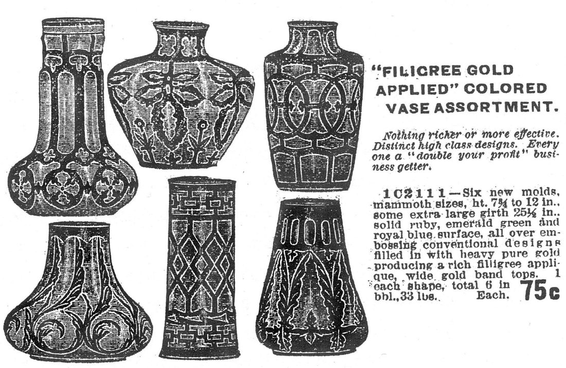
Above: Dugan "Filigree" line ad, Butler Brothers October, 1909.
|
|
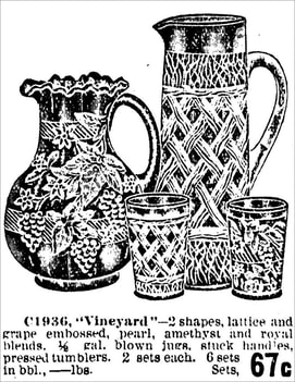
A 1912 ad for Dugan's Floral and Grape, and Grapevine Lattice water sets, where the patterns were described as "embossed".
|
The Design Inspirations
Although the pattern has been called Quill, we feel it’s fair to say that’s arguably not what the pattern represents. It is our view that Dugan’s Filigree patterns were in fact inspired by Art Nouveau design, and that Dugan’s Quill motif, and also their Waving Quill, were not intended to be quills at all. Arguably the most easily recognisable and typical Art Nouveau motifs were curves and organic, natural forms, often with repeating linear elements.
|
Just glance at the Butler’s ad at the top of this page and look at the Waving Quill vase, bottom left. It has the archetypal “whiplash” curves of Art Nouveau design (in vogue circa 1890-1910). The same organic forms, including curves, can be seen in many other examples of Dugan’s Filigree Line, including Quill. So … no feathers, no writing implements, instead we have a beautiful Art Nouveau design embodied in Carnival Glass. The pattern name Quill was given to the design by Marion Hartung in her Book Seven. She described it thus: “The name … obviously comes from the long feathered figures which sprout in pairs from the scroll design encircling the base”. Rose Presznick was of the same mind as Hartung, as she called the pattern Feather and Scroll. It’s easy to see why the motif was perceived to be a feather quill, but our belief is that it actually represents the organic leaf forms that are absolutely typical of Art Nouveau design (such as the William Morris tile panel on the right). The Dugan designer(s) would have been very familiar with the style. It was everywhere, in “style” books, journals, artefacts, wallpaper, fabrics and more. Even the U.S. Crockery & Glass Journal created their own Art Nouveau style graphics (below). 
|
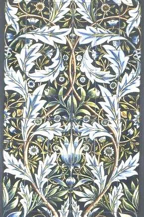
An Art Nouveau style William Morris
tile panel. |
|
Dugan’s Quill: a pure Art Nouveau style, showing once again how Carnival Glass mirrored and reflected society’s design trends, making fashionable items affordable for ordinary people in ordinary homes. The Quill pattern has not been found in Carnival Glass with an applied gold decoration, but Dugan did use this design style for other Carnival Glass items. Here on the right are two examples, both in white Carnival: Wreathed Cherries (found in berry sets and in water sets - pitcher and tumbler) and Dahlia (found in berry sets and in table sets - butter, creamer, spooner and sugar). Sometimes the gold decoration was used in combination with other colours such as the red cherries on this Wreathed Cherries water pitcher. |
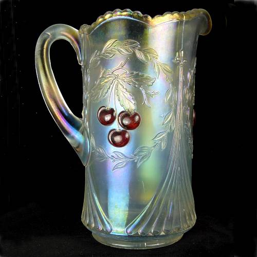
Wreathed Cherries water pitcher in white with gold and red applied decoration.
|
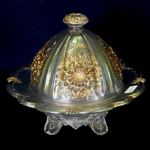
Dahlia covered butter in white with applied gold decoration. Courtesy Seeck Auctions.
|
See more Collectors Facts