NetworK ezine Issue 34. March 2018
Totally devoted to Carnival Glass

We are excited by the worldwide discoveries and revelations that we have for you in this March, 2018, edition of NetworK. Our readership continues to grow hugely each month, and we hope you all enjoy this fascinating issue. Let’s start our journey of discovery in Finland … Hoh’to-Lustra!
|
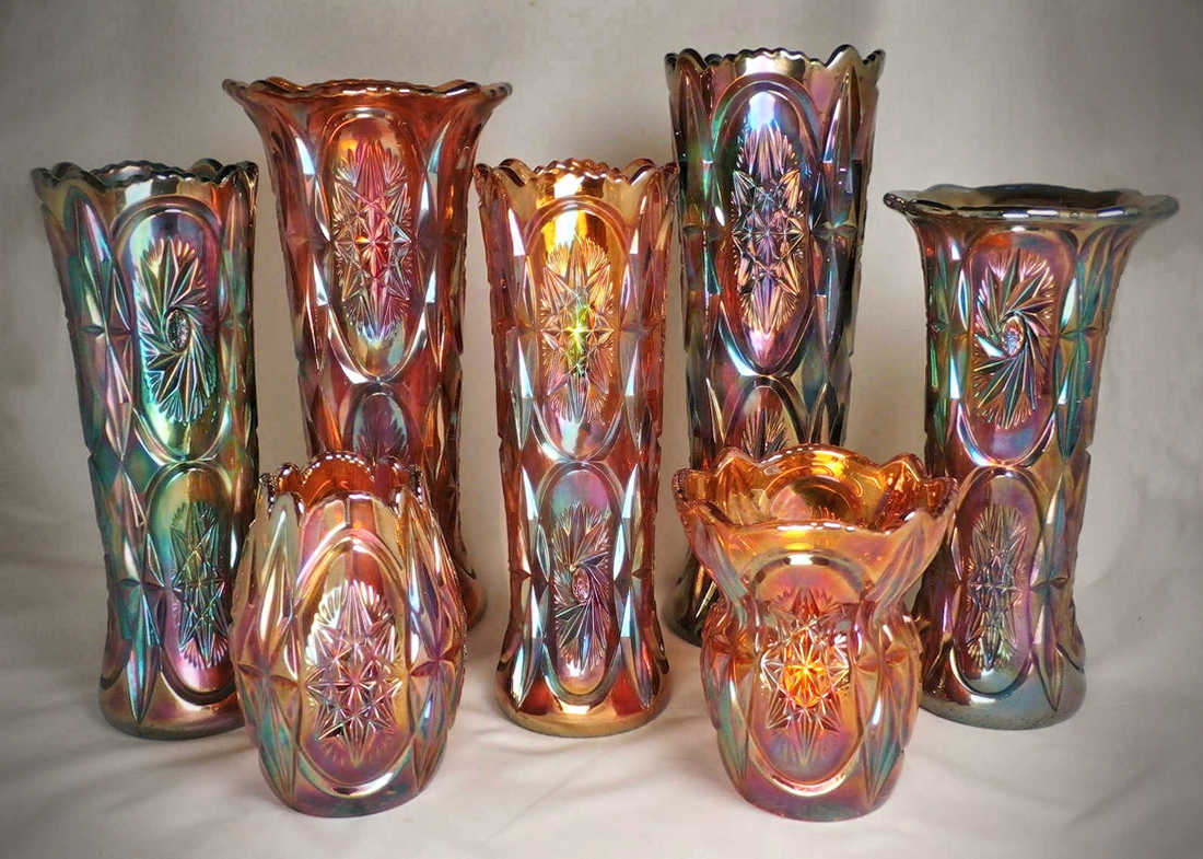
“Hoh’to-Lustra lasitavarat” was the term used by Riihimaki to describe their Carnival Glass, when they began producing it. The nearest we can get to a translation is “glowing, iridescent glassware” which describes it pretty well. On the right is a stunningly beautiful display of Riihimaki’s Starburst vases in three sizes. The Starburst pattern was originally called “Kero” by Riihimaki. The tallest (which we have called Double Starburst in our books and e-books) stand around 11 to 11½ inches, depending on the top shaping. The middle size vase is a little shorter, around 9 to 9½ inches. Both of these sizes have a repeated (double starburst) motif. The small Starburst vases stand around 5 inches high. Colours are blue, amber, marigold and pale pink. Also in the Starburst range was a stemmed vase (made in two sizes), which is known as Starburst and Diamonds, because it has a band of diamonds just below the starburst motif. |
|
Another "Carnival First"
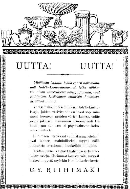
In this edition of NetworK, courtesy of Roger Peltonen, we are privileged to be able to share an amazing, absolutely fascinating revelation: a series of newspaper ads from Riihimaki - ads that launched and promoted their new range of “Hoh’to-Lustra” (Carnival Glass). The magnificent ad shown below was in a Finnish newspaper called the ”Riihimäen Sanomat” (a local Riihimaki paper).
Yes, the text is in Finnish, but Roger has kindly translated it for us. Crucially, this ad provides us with iconic and truly historic evidence:
Riihimaki was announcing a NEW range of glass - their Carnival Glass - to the public in April, 1928. *
|
These ads are important historical documents in terms of Carnival Glass, showing us exactly when Riihimaki began making Carnival, and illustrating the first patterns they introduced with iridescence. The line drawing at the top of the ad features an amazing illustration of a range of Riihimaki’s glass, and here is Roger's translation of the text for us: 
|
|
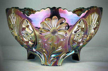
In the centre of the drawing at the top of the ad is a beautiful Sunk Daisy (as seen on the right). The tall pitcher shown there, and also the stemmed comport (sugar) and the small lidded bonbonniere, are in the pattern known as Laurel Band, called "Kara" by Finnish collectors.
The other patterns illustrated are less well known, and indeed some are not yet known at all in Carnival. The creamer and stemmed sugar on the right are called “Palmu” but as yet, we are not aware of them in iridescent glass. So, we have some mysteries as well as some answers. You can see all these early Riihimaki Carnival Glass ads plus the glass itself, in our new feature article. Bonus extras include a variety of other newspaper features from the Finnish press, about Riihimaki. It’s a fascinating look at this amazing glassworks, and the beautiful Carnival that it produced. Here is the link: Riihimaki Carnival Glass in the News. |
|
* Riihimaki was not the first to make Carnival in Finland: we believe that the very first Carnival Glass to be made there was from around 1923 at Koklaks, under the ownership of Claes Norstedt (who sold out to Riihimaki in 1927).
You can read all about this in detail in our e-book: over 60 Riihimaki patterns, from ALBIAN to ZIZZLE, each pictured and referenced to source catalogues. Shapes, sizes and colours of all patterns currently reported in Carnival are featured, and much more .... over 200 photographs and 170 catalogue images.
Everything you should know about Riihimaki brought together in one e-book- available by download or on CD, here: “Carnival Glass from Finland”.
|
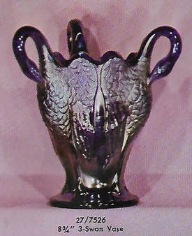
The Jewel in (Imperial's) crown
Let's jump forward to the 1960s when Imperial recognised the rapidly growing collector market for Carnival Glass, and they introduced Contemporary Carnival into their production. Some of their most beautiful and highly sought-after pieces were the ones they made in their Aurora Jewels (cobalt blue) range, which they made from mid 1970 through to mid 1972. We have added a wonderful 4 page catalogue to the Contemporary Carnival section of our website. It shows 25 pieces in this Aurora Jewels range, such as this fantastic 3-Swan Vase. We have also added the pattern names that they have been given by collectors. The original prices are also very eye-opening! Here is the link: Imperial's Aurora Jewels |
|
|
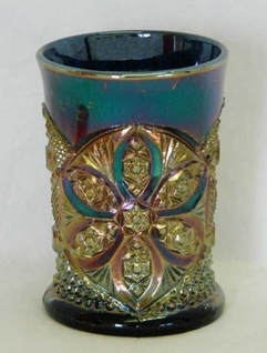
A South American Discovery
Over twenty years ago, in our early printed NetworK journal (#12, in 1996), we told the story of the first known, blue Omnibus water pitcher, which had been found in the UK. We were intrigued by it - and we pointed towards Argentina as the possible source of manufacture, despite the obvious connection with the U.S. Glass Co., which had issued the Omnibus pattern in 1911. In the same 1996 issue of NetworK we also featured the mysterious Lucile pitcher and tumbler, and similarly suggested that Argentina could be the source. Our research and observations have continued for over 20 years. And now … eureka! We were right - we found the proof in a previously unseen catalogue from Cristalerias Papini, which dates from 1933 (right). Note the reference to "NCP", more of which, later. 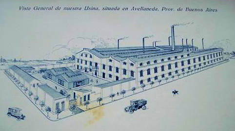
Above: the vast Cristalerias Papini, Argentina glassworks in 1933.
|
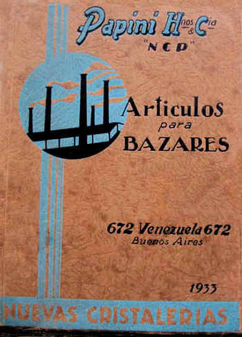
The cover of the 1933 Cristalerias Papini catalogue
|
|
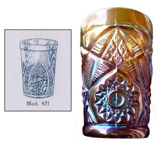
Here, in this fascinating 1933 catalogue from Cristalerias Papini is proof that they made Lucile. The images are low resolution, but the pattern identification is clear- it is Lucile. The actual tumbler shown on the right is in blue, courtesy of Seeck Auctions. 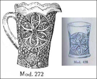
Lucile pattern shown in the 1933 catalogue
|
Lucile tumbler, blue. Seeck Auctions
|
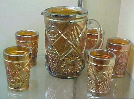
And there was another tumbler shown in the catalogue, which made us stop and think - could it be Omnibus?
The one in the catalogue appears to have all the same pattern elements as Omnibus, but clearly there is a large space above the pattern when compared with the Omnibus tumbler. We cannot rule in - or rule out - Cristalerias Papini at this stage, and more research is needed.
The one in the catalogue appears to have all the same pattern elements as Omnibus, but clearly there is a large space above the pattern when compared with the Omnibus tumbler. We cannot rule in - or rule out - Cristalerias Papini at this stage, and more research is needed.
|
Above: Papini catalogue on the left and an
olive green Omnibus tumbler, right. |
The Omnibus tumblers and pitcher illustrated above are all in a characteristic green (olive with a silvery or gold iridescence). Omnibus was a United States Glass Co. pattern, and Lucile was originally an Indiana Glass design, called Ferris Wheel. Lucile appears to have been copied (and altered a little) by Papini from the earlier, original USA design. Papini made new moulds based on the USA originals. Investigations continue ...
And the "NCP" on the catalogue?
Another interesting point arises from the catalogue. Look at the title: Papini Hermanos – Papini Brothers. Below it are the letters NCP, standing for Nuevas Cristalerias Papini – the New Papini Glassworks. This also answers another long-standing mystery. Several Carnival tumblers are known with the moulded letters NCP on the base. We have often wondered what it stood for, and now we know!
|
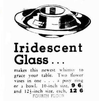
Smile - a Carnival Glass UFO?
This is an extract from an ad for “David Jones Budget Shop” in Sydney, Australia in 1937. But what is it? We are intrigued! Hopefully, someone, somewhere, has seen this mysterious and amazing item. Who has one of these? Please share it with us all. |
|
|
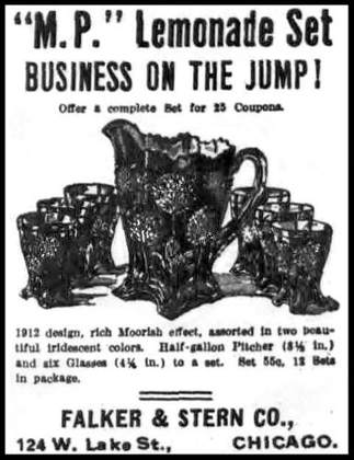
Orange Tree
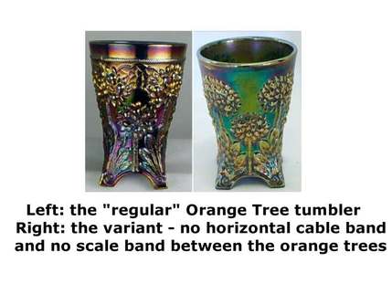
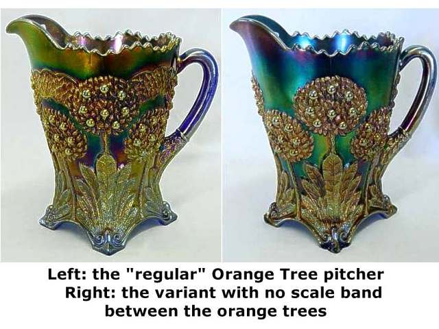
Shown on the right is a little gem of an ad that we discovered in a 1912 edition of The Billboard. Note how what we generally call a "water set" today was marketed as a "lemonade set" with a "rich Moorish effect" It reminded us of one of the discussions between Frank Fenton and Howard Seufer that Howard recorded in his "Howard Seufer presents ..." video series. In it, they provided us with a fascinating insight into production problems with the early runs of Fenton's Orange Tree tumblers. The problem meant that the tumbler mould had to be re-cut to add a thin horizontal "cable" band around the top, and a "scale" filler pattern between the tops of the orange trees. Then, the pitcher mould also had to be modified to match the re-cut tumbler, and the "scale" filler pattern was added. These screen shots shown below are taken from the video, and clearly show the differences. |
|
|
|
|
Wonderful Videos!
If you missed any of the videos in the "Howard Seufer Presents" series, here is the link to them- click on the image on the right. Each one runs for about 6 minutes. The unique footage converted and edited into these videos was filmed by the late Howard Seufer as part of a longer interview with Frank M. Fenton in 2004 inside the (now long-gone) Fenton Museum. They are fascinating and a real treat to watch! The videos are courtesy and Copyright, Marty Seufer, 2017-18. |

|
Join us on Facebook
We invite you and your friends to join us all on NetworK's fast growing and very active Facebook Group (link is below), and if you have missed any of the previous issues of NetworK and NetworK Specials, they are all here: Back Issues.
We invite you and your friends to join us all on NetworK's fast growing and very active Facebook Group (link is below), and if you have missed any of the previous issues of NetworK and NetworK Specials, they are all here: Back Issues.

